Why I Care So Much About Doing Analysis “Efficiently”
In my office, Excel is almost like oxygen. Finance uses it. Sales uses it. HR uses it. I use it for almost everything that has numbers.
For a long time, my “data analysis” in Excel was just filters and copy‑paste. Every month, I would repeat the same painful ritual: download a CSV, clean it by hand, build the same summary, get confused, break a formula, stay late.
One day my manager said in a meeting, “Could you refresh last quarter’s report? Should be quick, right?” I smiled and nodded. Inside I knew it meant another evening of dragging formulas across a thousand rows.
That was the moment I decided I had to treat Excel more seriously. Not as a calculator, but as a tool that should do the repetitive work for me.
So this is not a “perfect guide”. This is exactly how I use Excel now to analyze data fast enough that I can actually go home on time.
What “Efficient Data Analysis in Excel” Really Means at Work
For me, “efficient” has nothing to do with fancy math words. It means:
- I can refresh a report in minutes, not rebuild it.
- I don’t fear that one wrong click will destroy everything.
- Other people can understand my file.
- My laptop doesn’t sound like it’s about to take off.
Excel has more and more serious analytics tools now. On Windows, Excel for Microsoft 365 and Excel 2024 include Power Query and Power Pivot, which are made exactly for cleaning and modeling data, even millions of rows. 1
The trick is to use the right parts of Excel, instead of only copy‑paste and manual editing.
Before Opening Excel: A Few Questions That Save Hours
This part took me years to learn.
Before I jump into the spreadsheet, I ask myself:
- What question am I answering?
- “Which products are dropping in sales?”
- “Which teams are over budget?”
- Who will read this?
- A director only wants a clear chart and one sentence.
- A teammate might want a detailed table.
- How often will I need this?
- One‑time analysis?
- Or a monthly report that should refresh quickly?
If it’s recurring, I force myself to build a structure that I can reuse. That mindset alone completely changed how I work in Excel.
I also try to keep one “Raw_Data” sheet that I never touch manually. All cleaning and analysis happens on top of that.
Core Excel Features That Actually Make Analysis Faster
These are the features that gave me the biggest jump in speed. No magic. Just practical.
1. Turn your data into a proper Table
I used to keep everything in a plain grid. Now, almost every data set becomes a Table.
- Select your data
- Use
Ctrl + Ton Windows or the “Format as Table” button
Once it is a Table:
- Filters appear automatically.
- New rows keep the same formulas.
- Charts and PivotTables update more smoothly.
- You can refer to columns by name, which feels more human.
Small change, big difference.
2. Use filters, sorting, and quick highlights to “feel” the data
Before starting any serious analysis, I do a quick scan:
- Sort by date to see the range.
- Sort by amount to see extremes.
- Filter out obvious junk (blank rows, “test” entries).
- Use simple conditional formatting to highlight very high or very low values.
This is not advanced at all, but it helps me understand the shape of the data before doing anything fancy.
It’s like walking into a room and switching on the lights.
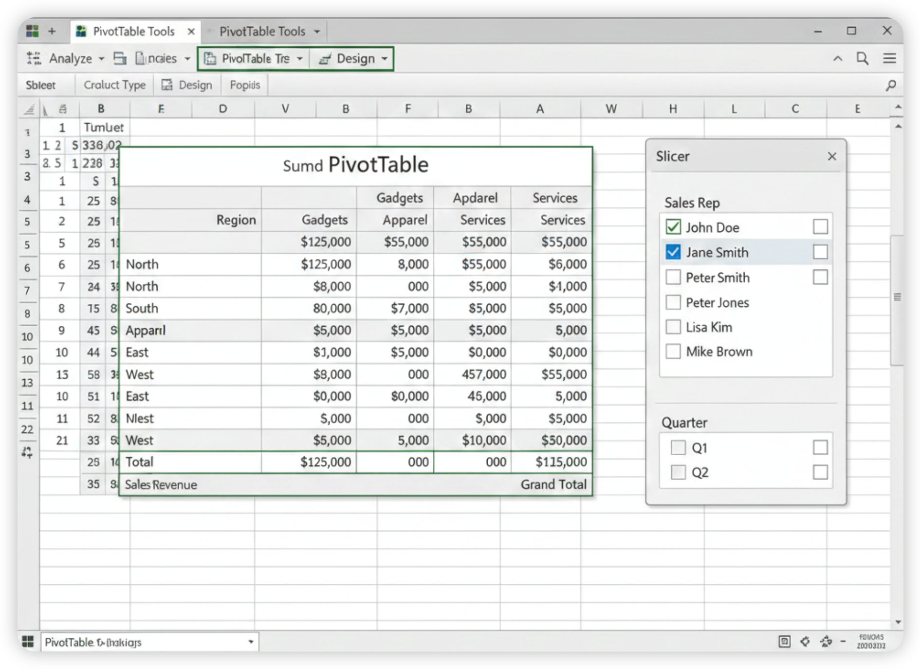
3. PivotTables: The thing I resisted for years
I avoided PivotTables for so long. The name sounded scary.
Now they are my main weapon.
Typical use:
- I have a list of transactions: date, region, customer, product, quantity, revenue.
- I insert a PivotTable.
- I drag “Region” and “Product” to rows.
- I drag “Revenue” to values.
- I add “Month” to columns.
Suddenly I see:
- Revenue by region and product
- By month
- With totals
No formulas in sight. If the data grows from 10,000 to 200,000 rows, the PivotTable doesn’t really care.
If I want interaction, I add slicers:
- One slicer for region
- One for product
- Maybe one for salesperson
Colleagues love clicking those buttons during meetings. It makes the file feel like a mini dashboard.
4. Charts that actually tell a story
I used to throw random pie charts everywhere. Guilty.
Now I keep it simple:
- Line charts for trends over time.
- Column charts for comparing groups (regions, products).
- Bar charts when labels are long.
- One clear title that answers the question, like “Revenue by Region – YTD”.
I link charts to PivotTables when possible. That way, slicers update both numbers and visuals together.
5. Dynamic array formulas: less dragging, more thinking
In newer Excel versions, formulas like UNIQUE, FILTER, and SORT can spill results into multiple cells automatically. 2
What this feels like in real work:
UNIQUEgives me a clean list of all products from one column.SORTcreates a sorted view without touching the original data.FILTERpulls only the rows I care about into a separate area.
I don’t have to drag formulas down 5,000 rows. One formula, entire result.
It feels like Excel finally decided to help instead of just watch me work.
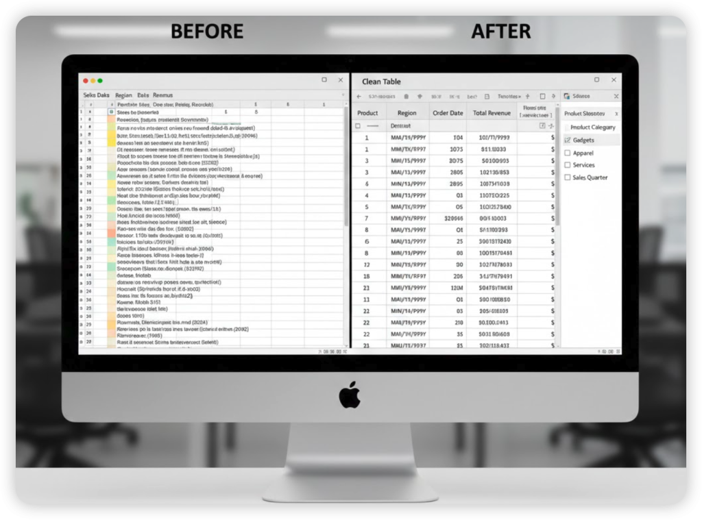
Handling Messy or Big Data Without Losing Your Mind
When files started to hit hundreds of thousands of rows, classic Excel began to suffer. That’s where two built‑in tools really helped me: Power Query and Power Pivot.
Power Query: My “data cleaning robot”
Power Query lives under “Get & Transform Data” on the Data tab in modern Excel. 1
From my perspective as a normal user, it does three things:
- Pulls data from many places: CSV, databases, other Excel files.
- Cleans it: remove columns, split text, change data types, merge tables.
- Reloads it into Excel with one Refresh button.
Example from my life:
- Every month the sales system exports one CSV per region.
- I used to open each file, copy into one master sheet, fix column names, delete headers, and so on.
- Now I set up Power Query once:
- It grabs all CSVs from a folder.
- Combines them.
- Standardizes column names.
- Filters out test records.
- Next month, I just drop the new CSV into the folder and click Refresh.
I’m not exaggerating: this alone saved me at least an hour every reporting cycle.
Small warning: The full Power Query and Power Pivot experience is best on Excel for Windows. Mac Excel has partial support and it is still improving. 1
Power Pivot: When your data lives in several tables
Power Pivot lets Excel handle relationships between tables, a bit like a mini database. 3
You might have:
- One table with all sales transactions.
- One table with product details.
- One table with sales targets.
With Power Pivot, you connect them by common keys (like Product ID) and build PivotTables on top of that whole model.
How it feels in practice:
- Fewer monster VLOOKUP or XLOOKUP chains.
- Easier to grow your model when new tables appear.
- Still inside Excel, not in some mysterious separate system.
Do you need this from day one? Probably not. But once your reports start to involve many linked tables, it is worth a look.
Functions I Actually Use All the Time (In Human Terms)
I don’t use every function under the sun. These are the ones that quietly work behind most of my reports:
SUMIFS: Add numbers with multiple conditions “Total revenue where region is East and product is A.”COUNTIFS: Count how many rows match certain conditions Great for counting orders, employees, tickets.AVERAGEIFS: Average with conditions “Average deal size for each salesperson.”XLOOKUP(orVLOOKUP/INDEX+MATCHif older Excel): Pull details from another table. For example, get the category name for each product.IF: Simple logic Label rows as “On Target” or “Below Target”.UNIQUE,FILTER,SORT: Create on‑the‑fly lists and views without extra sheets.
I keep formulas as simple as possible. If something gets complicated enough that I can’t explain it to another human in one sentence, I step back and rethink.
A Concrete Workflow: Monthly Sales Report
To make this less abstract, here’s how a typical recurring report goes for me now.
Scenario: Sales team wants a monthly overview by region and product, with trends and a few key metrics.
Rough flow:
- Raw data
- Export all transactions from the system for the month.
- Load them into Excel through Power Query, not by copy‑paste.
- Let Power Query:
- Clean column names.
- Fix data types.
- Remove empty or duplicate rows.
- Append to previous months if needed.
- Data model
- Load the cleaned data into a Table and/or the Data Model.
- If I have a separate Products table (with categories, margins), I connect it via Power Pivot.
- Analysis
- Build one main PivotTable for:
- Revenue by Region and Product.
- Month on the columns.
- Add slicers for:
- Region.
- Product category.
- Use simple measures or fields:
- Total revenue.
- Total quantity.
- Average price (revenue ÷ quantity).
- Build one main PivotTable for:
- Presentation
- Create a “Dashboard” sheet.
- Place key numbers on top: total revenue, growth vs last period.
- Place:
- One line chart for revenue over time.
- One bar chart for top products.
- Connect these charts to the main PivotTable.
- Refresh routine
- Next month:
- Drop new CSVs in the folder.
- Click Refresh in Power Query.
- PivotTables and charts update.
- No rebuilding from scratch.
- Next month:
Once this is set up, the “analysis” feels more like reading and asking questions, not fighting the file.
Excel vs Other Tools: How They Actually Feel at Work
I don’t work in a lab. I work in an office with real people, shared drives, and endless email threads.
So these are my honest feelings about Excel compared with a few common tools.
Quick comparison
| Tool | Best For | Strengths for Analysis | Annoyances in Daily Use |
|---|---|---|---|
| Excel (desktop) | Heavy data, complex models, detailed reports | Very strong analytics, Power Query/Power Pivot, huge add‑in ecosystem | Files can get huge, version chaos, full power mostly on Windows |
| Google Sheets | Team collaboration, quick shared sheets | Great real‑time editing, easy sharing, version history | Slower on large data, fewer advanced analysis tools than Excel 4 |
| Power BI | Dashboards and visuals from many systems | Beautiful interactive dashboards, connects to many data sources | Separate tool to learn, more setup, not as “Excel‑feeling” for everyday users |
| Excel + add‑ins | Niche analysis (stats, finance, data cleaning) | Adds specialized tools like advanced statistics, data cleaning, custom charts | Can be expensive, may confuse less technical teammates, installation/admin hurdles |
From my day‑to‑day experience:
- Google Sheets is perfect when several people need to poke at the same sheet at the same time. It shines in collaboration and sharing. But for big datasets and complex analysis, Excel is usually smoother and more powerful. 4
- Power BI is wonderful when management wants fancy dashboards on big screens. But for quick “can you check this number?” work, I stay in Excel.
- Excel add‑ins can turn Excel into a specialized tool. For example:
- XLSTAT adds advanced statistical analysis and even some machine learning, right inside Excel. 5
- Ablebits focuses on cleaning and managing messy data. 5
- Analystix Tools helps financial analysts with histograms, cost of capital, and more. 6
- NodeXL brings network analysis and social network graphs into Excel. 7
Most office workers I know don’t need all of those. For regular business analysis, modern Excel alone is already very strong.
Small Daily Habits That Quietly Change Everything
A few boring habits made my Excel life less painful:
- I avoid merged cells in data areas. They look pretty but break analysis.
- I give sheets clear names:
Raw_Data,Clean_Data,Pivots,Dashboard. - I write a short note in the top left of my main sheet: “Data source: CRM export, updated monthly. Refresh via Power Query.”
- I save recurring reports as templates, instead of starting from old copies full of hidden leftovers.
- I learn keyboard shortcuts little by little:
Ctrl + Tfor Tables.Alt + N + V(on many setups) for PivotTables.
- I try not to hide too many columns. Hidden columns become invisible problems.
None of this is glamorous. It just reduces random headaches.
My Honest Conclusion: Is Excel Worth Investing Real Time In?
Some days I still swear at Excel.
It crashes. Someone overwrites my file. A slicer disappears right before a meeting. I stare at a #VALUE! error for ten minutes, questioning my life choices.
Even with all that, I’m convinced of this:
If your job involves numbers, learning a handful of Excel data analysis habits is one of the highest‑return things you can do.
You don’t need to become a guru. You don’t need to learn every function.
From my own experience, this path already gives huge benefits:
- Use Tables instead of raw grids.
- Get comfortable with PivotTables and slicers.
- Use simple functions like
SUMIFSandXLOOKUP. - Let Power Query handle repeated cleaning.
- Keep reports structured so refreshes are easy.
Once I accepted that Excel should do the repetitive work, my evenings got a lot calmer. I still make mistakes, of course. But at least I’m not building the same report from scratch every month.
If you’ve been stuck in copy‑paste hell like I was, maybe pick one thing from this article and try it in your next report. You might be surprised how much smoother Excel can feel when it’s actually on your side.